User-written IELTS example
Writing Academic Task 1 Band 9.0 Example
Original task prompt, user essay, band score, and related examples in the same report workspace.
Illustrative target band for this original model answer.
Plan your answer
Try your own response before reading the samples.
Ideas to explore
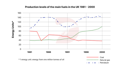
- Petroleum was the leading fuel throughout, reaching about 140 in the mid-1980s, dipping around 1990–91, then recovering to a similar level.
- Coal had a sharp early fall, a partial rebound, and then a longer decline to about 35 by 2000.
- Natural gas stayed near 40 for much of the 1980s, rose strongly after 1991, and ended at about 100, above coal but below petroleum.
Suggested structure
- Introduce the graph by naming the three fuels, the UK, the years and the unit.
- Give an overview of the overall ranking and the contrasting directions of change.
- Describe petroleum’s rise, dip and recovery with key dates and approximate figures.
- Compare coal’s decline with natural gas’s later growth, including their end values.
Useful vocabulary & examples
- remain the leading source
- continue to have the highest production level among the categories.
Petroleum remained the leading source throughout the period.
- fall sharply
- decrease quickly and substantially over a relatively short interval.
Coal production fell sharply to around 40 in 1984.
- recover to approximately
- rise again after a decline to reach a similar or specified level.
Petroleum recovered to approximately 140 in 1996.
- overtake
- become greater than another category after previously being lower.
Natural gas overtook coal in the early 1990s.
Task Prompt
User Essay Analysis
Review the public answer with report-style highlights.
The graph illustrates the production trends of three primary fuel sources in the United Kingdom between 1981 and 2000, with energy units measured as equivalent to one million tons of oil. The overall pattern reveals a significant shift in the dominance of fuel sources over the two-decade period, with natural gas experiencing a substantial surge, while coal production declined overall. Petroleum output began at about 90 units in 1981 and rose sharply to around 140 by the middle of the 1980s. It then fell gradually, reaching roughly 100 in 1990–91, before recovering and fluctuating around 140–150 for the rest of the period. It was the highest-producing fuel throughout. Coal started at approximately 80 units, but its output dropped abruptly to just under 40 in 1984. After recovering to around 60 in 1986, it generally trended downward, ending at about 35 units. By contrast, natural-gas production stayed close to 40 units during the 1980s, then increased from the early 1990s, accelerating in the middle of that decade. It overtook coal at around 1992 and reached approximately 100 units by 2000. Thus, although petroleum remained dominant, gas was the only fuel to finish substantially above its starting level.
Targeted Improvement Tips
Related examples for this topic
Compare different bands on the same IELTS prompt.
The chart presents a comprehensive overview of the production trends of three primary fuel sources in the United Kingdom over a period of 19 years starting from 1981. The overal...
Band 8.0The provided illustration presents the production levels of the predominant fuel types in the UK from 1981 to 2000. The fuels depicted are coal, natural gas, and petroleum, with...
Band 7.0The supplied graph illustrates the production levels of the main types of fuel in the United Kingdom from 1981 to 2000. Looking from an overall perspective, it is readily appare...
Band 6.0The displayed line graph depicts the volume of the premier fuels produced in the United Kingdom from 1981 to 2000. Looking at the details, there was a dramatic decrease in use o...
Band 5.0The graph gives information about amount of extracted petroleum, coal and natural gas in the UK from 1981 to 2000, measured in energy units. It is noticeable that petroleum and...
Band 4.0The line graph illustrates the production levels of three kinds of fossil fuel in the UK from 1981 to 2000. Overall, while level of petroleum and natural gas increased remarkabl...
