User-written IELTS example
Writing Academic Task 1 Band 8.0 Example
Original task prompt, user essay, band score, and related examples in the same report workspace.
Illustrative target band for this original model answer.
Plan your answer
Try your own response before reading the samples.
Ideas to explore
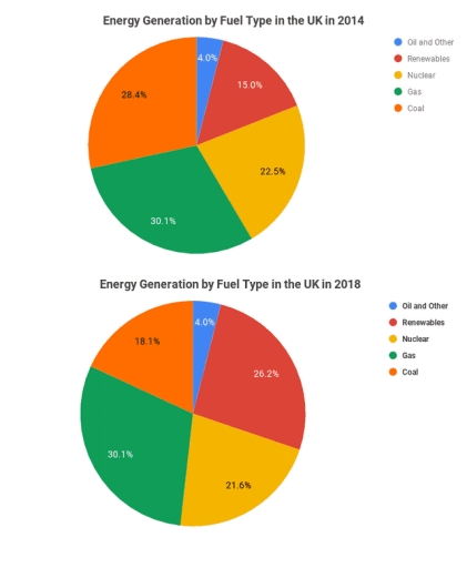
- Renewables rose from 15.0% in 2014 to 26.2% in 2018, the most notable increase.
- Coal fell from 28.4% to 18.1%, while nuclear declined slightly from 22.5% to 21.6%.
- Gas remained the largest category at 30.1% in both years; Oil and Other stayed at 4.0%.
Suggested structure
- Introduce the two pie charts, the UK, the years and the percentage measure.
- Give an overview highlighting the main increase, the main decrease and stable categories.
- Compare the 2014 shares, grouping the larger sources before the smaller ones.
- Describe the 2018 figures and directly compare them with 2014.
Useful vocabulary & examples
- accounted for
- made up a particular proportion of the total
Gas accounted for 30.1% of energy generation in both years.
- remained unchanged
- stayed at the same level
The share for Oil and Other remained unchanged at 4.0%.
- recorded the largest increase
- showed the biggest rise in the figures
Renewables recorded the largest increase between 2014 and 2018.
- fell by 10.3 percentage points
- decreased by the difference between two percentage values
Coal fell by 10.3 percentage points, from 28.4% to 18.1%.
Task Prompt
User Essay Analysis
Review the public answer with report-style highlights.
The pie chart illustrates the proportions of energy generation using different fuel sources in the UK over two separate years, 2014 and 2018. Overall, while nuclear energy and coal recorded a decline in the production of energy over the 2014-2018 period, renewable energy followed an upward trajectory; however, oil & other and gas stood out for remaining unchanged in share. In 2014, gas was the largest source, at 30.1%, followed by coal at 28.4%. Nuclear energy accounted for 22.5%, while renewables made up 15.0%; oil and other sources were the smallest category, at 4.0%. By 2018, renewables had risen to 26.2%, an increase of 11.2 percentage points, and became the second-largest source, overtaking both coal and nuclear. Coal experienced the sharpest fall, dropping 10.3 percentage points to 18.1%. Nuclear's share edged down by 0.9 points to 21.6%, whereas gas remained at 30.1%. Oil and other fuels also stayed constant at 4.0%. Thus, the mix shifted away from coal towards renewables, while gas continued to be the leading source.
Targeted Improvement Tips
Related examples for this topic
Compare different bands on the same IELTS prompt.
The pie charts compare the proportions of energy generated from five different sources in the UK in 2014 and 2018. Overall, coal and nuclear experienced downward trends, albeit...
Band 8.0The pie charts compare the proportion of energy generated from five fuel sources, namely coal, gas, nuclear, renewables, and oil and other fuels in the UK from 2014 to 2018. Ove...
Band 7.0The pie charts compare the energy production categorized by different fuel types in the UK between 2014 and 2018. In general, the percentage of renewable energy in generation in...
Band 6.0The pie charts compare the amount of energy produced by five different energy sources, in the UK in 2014 and 2018. Overall, it is clear that gas was the majority of energy sourc...
Band 5.0The pie chart shows energy generation by fuel type in the UK between 2014 and 2018. Overall, the most energy generation used in 2014 and 2018 was the gas as the highest, and the...
Band 4.0The pie chart provides key information about power generation from different types in the United kingdom during two years. The units are measuerd in years. Overall, it is clear...
