User-written IELTS example
Writing Academic Task 1 Band 4.0 Example
Original task prompt, user essay, band score, and related examples in the same report workspace.
Illustrative target band for this original model answer.
Plan your answer
Try your own response before reading the samples.
Ideas to explore
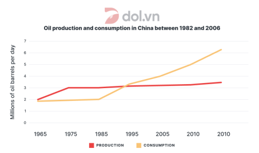
- Compare which series begins higher and which one ends higher; here, production starts slightly above consumption, but consumption finishes much higher.
- Identify the different rates of change: production rises gradually, while consumption accelerates after the early plotted years.
- Mention the axis-label problem: the task’s stated dates do not match the displayed years, and the last year is printed twice.
Suggested structure
- Introduce the graph, measures, and units.
- Give an overview of the overall direction and the main contrast between the two lines.
- Describe production’s starting level, plateau, and gradual later rise.
- Describe consumption’s early stability and sharper increase, then compare the final plotted values.
- Briefly note that the displayed dates are inconsistent or duplicated where this affects interpretation.
Useful vocabulary & examples
- rose gradually
- increased slowly over time
Oil production rose gradually after remaining near 3 million barrels per day.
- remained stable
- stayed at approximately the same level
Production remained stable at around 3 million barrels per day for a period.
- increased substantially
- went up by a large amount
Consumption increased substantially and reached about 6.3 million barrels per day at the final plotted point.
- the gap widened
- the difference between two values became greater
The gap between oil consumption and production widened as consumption climbed.
Task Prompt
User Essay Analysis
Review the public answer with report-style highlights.
The line chart illustrates the proportion of oil production and consumption in China among 1982 to 2006. Overall,it can be seen that oil consumption seems more dominant and preffered type in China there was a abrupt rise trend in consumption of China.However,production of oil slightly grow in throught the years. China of the expenditures remained unclear in the graph, because it does not show expenditures; it compares oil production and consumption. At first, production was about 2 million barrels per day and consumption was a little lower, at nearly 1.8. Production went up to around 3 in 1975 and stayed at this level until 1985. After that it rose only slowly, reaching about 3.5 at the last point. Consumption changed more. It was close to 2 in the first years and then increased quickly after 1985. It reached about 3.3 in 1995, which was higher than production. Then it continued to rise to 4 in 2005, 5 in 2010 and around 6.3 at the final plotted point. The labels at the end of the horizontal axis both say 2010, so the exact year for the final value is unclear. In general, production did not change a lot compared with consumption, and the gap between these lines became much bigger. Both measures are shown in millions of barrels per day.
Targeted Improvement Tips
Related examples for this topic
Compare different bands on the same IELTS prompt.
The line graph illustrates the amount of oil produced and consumed daily in China from 1982 to 2006, measured in millions of barrels day. Overall, it can be seen that both oil p...
Band 8.0The line graph illustrates the trends in oil production and consumption in China from 1982 to 2006, measured in millions of barrels per day. Overall, both production and consump...
Band 7.0The line graph illustrates the daily amount of oil consumed and produced in China from 1982 to 2006. It can clearly be seen that China saw increases in both oil production and c...
Band 6.0The line graph illustrates China’s production and consumption of oil from 1982 to 2006. In this period, the amount of oil being produced has remained relatively constant. On the...
Band 5.0This line graph provides information about the consumption and production of oil in China from 1982 to 2006.The data is measured in millions of oil barrels per day. Overall,ther...
Band 4.0The line graph illustrates the amount of oil produced and consumed in China between 1965 and 2025, are measured in million barrels per day Overall, it evident from the data that...
