AI-completed learning example
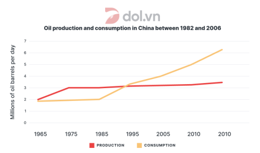
226 words · Illustrative target bandThe line chart illustrates the proportion of oil production and consumption in China among 1982 to 2006. Overall,it can be seen that oil consumption seems more dominant and preffered type in China there was a abrupt rise trend in consumption of China.However,production of oil slightly grow in throught the years. China of the expenditures remained unclear in the graph, because it does not show expenditures; it compare…
Read full answer & analysis →AI-completed learning example
202 words · Illustrative target bandThe line graph illustrates the amount of oil produced and consumed daily in China from 1982 to 2006, measured in millions of barrels day. Overall, it can be seen that both oil production and consumption increased during the period. However, oil consumption rose more sharply and eventually exceeded oil production after the early 1990s. China experienced a gradual but uneven change in these two measures. At the beginni…
Read full answer & analysis →AI-completed learning example
201 words · Illustrative target bandThe line graph illustrates the amount of oil producted and consumed daily in China from 1982 to 2006, measured in millions of barrels day. Overall, it can be seen that both oil production and consumption increased during the period. However, oil consumption rose more sharply and eventually exceeded oil production after the early 1990. China's production was about 2 million barrels per day at the first plotted point, …
Read full answer & analysis →AI-completed learning example
245 words · Illustrative target bandThe line graph illustrates the amount of oil produced and consumed in China between 1965 and 2025, are measured in million barrels per day Overall, it evident from the data that, the both production and consumption is increasing over the period of time, but the consumption of oil was drastically boom than production from the initial plotted point to the endpoint.
Overall, both series increase, but consumption rises …
Read full answer & analysis →AI-completed learning example
210 words · Illustrative target bandThe line graph illustrates the trends in oil production and consumption in China from 1982 to 2006, measured in millions of barrels per day. Overall, both production and consumption exhibit an upward trajectory, with consumption significantly outpacing production in the later years. In 1982, China’s oil production stood at 2 million barrels per day, showing the starting point for a subsequent modest rise. It then cli…
Read full answer & analysis →AI-completed learning example
204 words · Illustrative target bandThe line graph illustrates the oil production and consumption in China from 1982 to 2006. Over this time period, both oil production and consumption in China experienced a steady increase. In 1982, oil production and consumption were around 2 million barrels per day, and by 2006, they had risen to approximately 3.5 million barrels per day. However, this statement needs qualification: at the plotted endpoint, producti…
Read full answer & analysis →AI-completed learning example
213 words · Illustrative target bandThe line graph below indicates the oil was manufactured and consumed by Chinese people from 1982 to 2006. Overall, the product of manufacturing oil witnessed a stable outcomes however it was not true for this consumption that saw the increasing in demand for using oil throughout the period. According to the given data, 1982 had no clearly labelled value, because the years printed on the horizontal axis are 1965, 1975…
Read full answer & analysis →AI-completed learning example
189 words · Illustrative target bandThe line graph illustrates the amount of oil production and consumption in China from 1982 to 2006. Overall, production and consumption were at the same level only twice: in 1982 and around 1994. It is evident that consumption surpassed production after 1994. In 1982, both production and consumption were approximately 2 million barrels of oil per day. By the next recorded point, production had risen to about 3 millio…
Read full answer & analysis →AI-completed learning example
230 words · Illustrative target bandThe given graph illustrates how much oil was produced and consumed in China over the 24-year course from 1982 to 2006. Overall, it is evident that oil output and consumption in China witnessed an upward trend over the examined span, despite an 8-year stability recorded in both figures. Also of note is that the gap between the two measures widened considerably as consumption eventually overtook production. The chart’s…
Read full answer & analysis →AI-completed learning example
200 words · Illustrative target bandThis line graph provides information about the consumption and production of oil in China from 1982 to 2006.The data is measured in millions of oil barrels per day. Overall,there is an upward trend in both consumption and production of oil in China.But the consumption of oil increases very fast with the passage of time. In the first observation, production stands at about 2 million barrels per day, slightly above con…
Read full answer & analysis →AI-completed learning example
205 words · Illustrative target bandThe line graph below compares production and consumption of oil in China from 1982 to 2006. Overall, it is clear that although the oil used in first eight years was stable, it showed a significant rise in next 15 years to outscale the level of oil production which present slight increase over the mentioned period. According to the plotted lines, production began at about 2 million barrels per day and climbed to rough…
Read full answer & analysis →AI-completed learning example
222 words · Illustrative target bandThe line graph illustrates the daily amount of oil consumed and produced in China from 1982 to 2006. It can clearly be seen that China saw increases in both oil production and consumption. However, there were differences in terms of the growth rate over the period surveyed. In 1982, Chinese people consumed and produced just under 2 million barrels per day in consumption and just under 3 million in production. These 1…
Read full answer & analysis →