User-written IELTS example
Writing Academic Task 1 Band 7.0 Example
Original task prompt, user essay, band score, and related examples in the same report workspace.
Illustrative target band for this original model answer.
Plan your answer
Try your own response before reading the samples.
Ideas to explore
- Compare the pace of adoption: refrigerator ownership rose especially quickly between 1940 and 1960, while washing-machine ownership changed more gradually.
- Identify milestones in appliance ownership: refrigerators reached 100% by 1980, and vacuum cleaners did so by 2000.
- Set the decline in housework hours alongside rising appliance ownership, while avoiding claims that the charts prove one trend caused the other.
Suggested structure
- Introduce both charts, the measures shown and the 1920–2019 period.
- Give an overview of the broad appliance-ownership increases and the fall in housework hours.
- Compare the three appliances, highlighting their starting points and the years they reached universal ownership.
- Describe the housework-hour decline chronologically, noting the plateau at 15 hours between 1980 and 2000.
Useful vocabulary & examples
- household ownership
- the proportion of households that have a particular item
Household ownership of refrigerators rose to 100% by 1980.
- reach universal ownership
- be owned by all households shown in the chart
Vacuum cleaners reached universal ownership in 2000.
- edge down
- decrease slightly
Washing-machine ownership edged down between 1960 and 1980.
- remain at that level
- stay unchanged at a previously stated figure
Housework time remained at 15 hours per week from 1980 to 2000.
Task Prompt
User Essay Analysis
Review the public answer with report-style highlights.
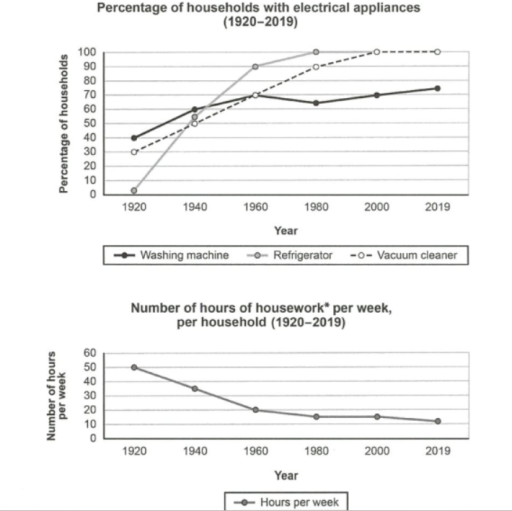
The above line chart illustrates the change in the percentage of households that own three particular electrical appliances from 1920 to 2019, while the below line chart displays the number of hours spent on housework per week in each household across the same time period. Through observation of the above graph, it is apparent that ownership of all three appliances rose overall, whereas weekly housework time fell substantially. Refrigerators and vacuum cleaners became nearly universal, while washing machines increased more gradually.
In 1920, washing machines were the most common appliance, present in 40% of households, compared with 30% for vacuum cleaners and almost none for refrigerators. By 1940, washing-machine ownership had reached 60%, while both refrigerators and vacuum cleaners were at about 50%. In 1960, refrigerator ownership climbed sharply to 90%, and the other two appliances were each owned by around 70% of households.
After 1960, refrigerator ownership reached 100% by 1980 and stayed there. Vacuum cleaner ownership rose from 70% in 1960 to 90% in 1980, reaching 100% in 2000 and remaining at that level in 2019. Washing-machine ownership dipped slightly to about 65% in 1980, then recovered to 75% by 2019. Meanwhile, housework fell from 50 hours per week in 1920 to 20 in 1960 and approximately 10 in 2019, with a level of about 15 hours in both 1980 and 2000.
Targeted Improvement Tips
Related examples for this topic
Compare different bands on the same IELTS prompt.
The provided charts present a compelling depiction of the evolution of electrical appliance ownership and its corresponding impact on the amount of time dedicated to housework w...
Band 8.0The presented graphs depict a dramatic transformation in appliance ownership and housework hours within a specific nation from 1920 to 2019. A clear upward trend is evident in o...
Band 7.0The provided charts illustrate the changes in the ownership of electrical appliances and the amount of time spent on housework in households in a particular country from 1920 to...
Band 6.0The line charts provided information on the changes in the presence of three different household equipment, as well as the durations of doing household chores in families in a n...
Band 5.0The graphs showed the shifting of households percentage owning electrical appliances (washing machine, refrigerator, and vacuum cleaner) and household spent time (hours) on hous...
Band 4.0The line graph illustrates the different electrical appliances percentage in households as well as number of hours needed in per week for work at home in a country from 1920 to...
