User-written IELTS example
Writing Academic Task 1 Band 4.0 Example
Original task prompt, user essay, band score, and related examples in the same report workspace.
Illustrative target band for this original model answer.
Plan your answer
Try your own response before reading the samples.
Ideas to explore
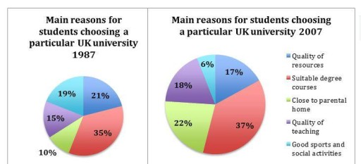
- Compare the leading reason across both years: suitable degree courses ranked first, rising slightly from 35% to 37%.
- Highlight the largest increase: choosing a university close to the parental home went from 10% to 22%.
- Contrast the sharpest decline with the smaller fall: sports and social activities dropped from 19% to 6%, while quality of resources moved from 21% to 17%.
Suggested structure
- Paraphrase the chart topic and identify both years.
- Give an overview of the top reason and the most notable increases and decreases.
- Describe the 1987 figures, grouping the largest and smallest categories.
- Compare the 2007 figures with 1987, using exact percentages and clear change language.
Useful vocabulary & examples
- accounted for
- made up a particular percentage or share
Suitable degree courses accounted for 35% of responses in 1987.
- rose slightly
- increased by a small amount
The share choosing suitable degree courses rose slightly to 37%.
- increased considerably
- grew by a noticeable amount
The proportion choosing a university close to home increased considerably, from 10% to 22%.
- fell substantially
- decreased by a large amount
Good sports and social activities fell substantially, from 19% to 6%.
Task Prompt
User Essay Analysis
Review the public answer with report-style highlights.
The pie charts compare the percentage of main reasons why American students chose a particular university between 1997 and 2007 Overall, the proportion of students chose university because the suitable degree courses accounted for the highest in both years while the number for proximity to parental home is lowest. Between 1997 and 2007 the proportion of students choosing the other factors also changed. The chart itself labels the first year as 1987, although the question states 1997, so the figures below follow the printed chart label. In 1987, suitable degree courses made up 35%, compared with 37% in 2007, and remained the main reason. Quality of resources fell from 21% to 17%, while good sports and social activities dropped from 19% to 6%. In contrast, the share choosing closeness to the parental home rose from 10% to 22%, making it the second most popular reason in 2007. Quality of teaching increased slightly, from 15% to 18%. Overall, degree-course suitability was the leading factor in both years. Sports and social activities recorded the sharpest decline, whereas proximity to home showed the biggest rise.
Targeted Improvement Tips
Related examples for this topic
Compare different bands on the same IELTS prompt.
The two pie charts illustrate primary factors that influenced students’ decisions to pursue higher education institutions in the UK from 1997 to 2007. Overall, it is evident tha...
Band 8.0The pie graphs illustrate information regarding five primary factors driving the university selection of students in the UK between 1997 and 2007. Overall, there was a decreasin...
Band 7.0The charts illustrate how many school leavers chose to study at a certain university in the UK between 1987 and 2007. Overall, there was an increase in the proportion of young p...
Band 6.0The provided pie charts illustrate the dominant reasons motivating student choices at a specific UK university in 1987 and 2007. Overall, it can be seen that Suitable degree cou...
Band 5.0Overall, it is clearly observed that the matchable degree courses were the most popular chosen by academicians. In addition, the percentage of most selective factors changed rel...
Band 4.0The pie charts illustrates that key factors influencing students’ choice of UK universities in 1987 and 2007. Overall, Close to parental home rose during time-frame, while a fal...
