

Task 1 · line graph · 18 samples

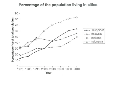
The graph below gives information about the percentage of the population in 4 Asian countries living in cities from 1970 to 2020, with predictions for 2030 and 2040

Data or diagram for the writing questionPractise this task →

Plan your answer

Try your own response before reading the samples.

Ideas to explore

  • Compare the overall upward direction with differences in pace: Malaysia rises steadily, while Indonesia’s growth accelerates after 2000.
  • Highlight meaningful exceptions to a simple upward trend, especially the Philippines’ fall after 1990 and Thailand’s extended plateau.
  • Use the final-year figures to compare the projected ranking: Malaysia is highest, Indonesia next, the Philippines below it, and Thailand lowest.

Suggested structure

  1. Paraphrase the graph’s subject, countries, and time span in the introduction.
  2. Give an overview of the overall direction and the main contrast in projected levels.
  3. Describe starting values and Malaysia’s steady rise.
  4. Compare the Philippines’ dip and recovery with Indonesia’s stronger later growth.
  5. Finish the detailed comparison with Thailand’s plateau and forecast increase.
Useful vocabulary & examples
urban population share
the percentage of a population living in cities

Malaysia’s urban population share is projected to exceed 80% by 2040.

reach a peak
attain the highest point in a period

The Philippines reached a peak of about 48% in 1990.

remain broadly stable
stay at a similar level, with little overall change

Thailand’s figure remained broadly stable near 30% for several years.

be projected to
be expected or forecast to happen

Indonesia’s urban share is projected to reach about 64% in 2040.

Sample answers

AI-completed learning example

200 words · Illustrative target band

This table provides information on the changes in the urban population ratios of four Asian countries from 1970 to 2020, and also predicts the data on urban population ratio changes up to 2040. Overall, the urban populations of the four countries on the chart are all showing an upward trend. However, the urban population ratios were at different levels and followed distinct patterns. Malaysia and the Philippines both…

Read full answer & analysis →

AI-completed learning example

196 words · Illustrative target band

This graph illustrates the proportions of people living in urban areas in the four different Asian nations between 1970 and 2020, along with projections for 2030 and 2040. Overall, all four countries experienced an upward trend throughout the period and are expected to reach their peak in 2040. Less than one-third of citizens in Malaysia were living in cities in 1970, at approximately 30%. Its figure then rose steadi…

Read full answer & analysis →

AI-completed learning example

206 words · Illustrative target band

The graph illustrates the proportions of people residing in cities in four different Asian countries between 1970 and 2020, along with the foresee in 2030 and 2040. Overall, all four nations experienced an upward trend and are expected to reach the peak in the end. The percentage of both Malaysia and the Philippines started at about 30% in 1970, whereas Indonesia and Thailand were lower, at roughly 13% and 18%, respe…

Read full answer & analysis →