User-written IELTS example
Writing Academic Task 1 Band 9.0 Example
Original task prompt, user essay, band score, and related examples in the same report workspace.
Illustrative target band for this original model answer.
Plan your answer
Try your own response before reading the samples.
Ideas to explore
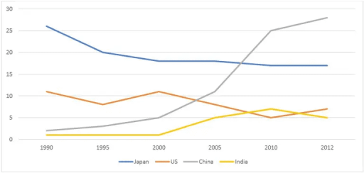
- Highlight the main crossover: Japan leads in the earlier years, while China overtakes it between 2005 and 2010.
- Contrast China’s steep late increase with Japan’s gradual decline.
- Note that the smaller series do not follow one pattern: the US fluctuates, whereas India rises to a peak and then falls.
Suggested structure
- Paraphrase what the graph measures and give the years covered.
- Summarise the overall ranking change and the main trends without listing every figure.
- Compare Japan and the US, using starting points, changes and final values.
- Describe China and India together, emphasising China’s sharp late rise and India’s smaller peak and decline.
Useful vocabulary & examples
- accounted for
- formed a particular percentage or share of the total
Japan accounted for about 26% of Australian exports in 1990.
- rose sharply
- increased quickly and substantially
China’s share rose sharply after 2005.
- fluctuated
- went up and down rather than changing steadily in one direction
The percentage for the US fluctuated over the period.
- peaked at
- reached its highest point at a particular value
India’s share peaked at about 7% in 2010.
Task Prompt
User Essay Analysis
Review the public answer with report-style highlights.
The provided line graph illustrates the percentage of Australian exports to Japan, the US, China, and India from 1990 to 2012. Overall, the export trends varied significantly. Exports to Japan decreased steadily from 25% in 1990 to around 15% in 2012. Conversely, exports to China surged dramatically, rising from 5% to nearly 30% over the period. China's share then continued to rise, reaching about 28% in 2012, and it overtook Japan between 2005 and 2010 to become Australia's largest export destination among the four. The US figure began at approximately 11% in 1990, fell to 8% in 1995, recovered to 11% in 2000, and then declined to 5% in 2010 before ending at 7%. India's share remained close to 1% until 2000, after which it climbed to 5% in 2005 and peaked at 7% in 2010, before falling to 5% in 2012.
In comparison, Japan was the leading destination at the beginning, but its share fell to about 17% by 2010 and remained stable through 2012. China showed the opposite pattern, with the sharpest overall growth. By the end, China ranked first and Japan second, while the US and India were at similar levels, at 7% and 5% respectively.
Targeted Improvement Tips
Related examples for this topic
Compare different bands on the same IELTS prompt.
The provided line graph displays the distribution percentages of Australian exports to four specific countries over a span of 22 years from 1990 to 2012. Overall, China emerged...
Band 8.0The line graph illustrates the proportion of Australian exports to four countries—Japan, the US, China, and India—over the period from 1990 to 2012. Overall, Japan was the leadi...
Band 7.0The graph illustrates Australia’s export rates to four different destination countries – Japan, the US, China, and India – from 1990 to 2012. In 1990, Australia exported the mos...
Band 6.0The line graph compares the proportion of Australian international trade with different countries over a 12-year period from 1990 to 2012. It can be clearly observed that the fi...
Band 5.0The line graph below illustrates about australian exports to Japan,US,China and India from the years 1990 to 2012. Overall, exports to Japan ,US and India showed an decrease whe...
Band 4.0The information about Australian export with four different countries namely :- Japan, Us, China, and india for the period between 1990 and 2012 is depicted in the provided line...
