User-written IELTS example
Writing Academic Task 1 Band 8.0 Example
Original task prompt, user essay, band score, and related examples in the same report workspace.
Illustrative target band for this original model answer.
Plan your answer
Try your own response before reading the samples.
Ideas to explore
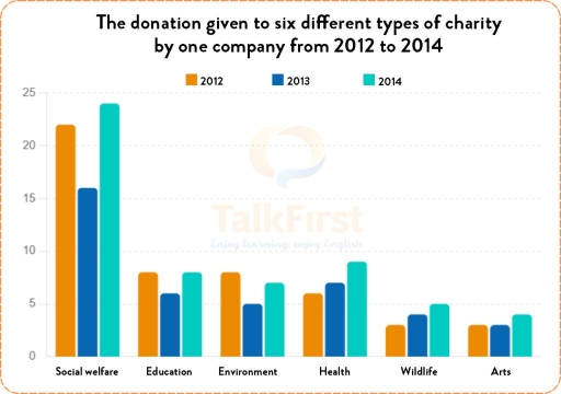
- Identify the category that dominates throughout: social welfare leads in all three years, reaching its highest figure in 2014.
- Separate steady increases from fluctuating or recovering patterns: health and wildlife rise each year, whereas social welfare falls before rebounding.
- Notice categories that finish at or near their starting values: education returns to 8, while environment ends at 7 compared with 8 initially.
Suggested structure
- Introduce the chart by naming the measure, the six charity types and the 2012–2014 period.
- Give an overview identifying the largest category and the broad direction of change.
- Describe social welfare separately because its figures are much higher and fluctuate notably.
- Group the remaining categories by pattern, comparing their starting, middle and final figures.
- End with a concise comparison of which categories finished higher, level or lower than in 2012.
Useful vocabulary & examples
- a steady upward path
- A consistent increase across successive years.
Health followed a steady upward path, rising from 6 to 9.
- fell before recovering
- Decreased at first and then rose again.
Environment fell to 5 before recovering to 7.
- returned to its starting figure
- Ended at the same value as at the beginning.
Education returned to its starting figure of 8 in 2014.
- edged up
- Increased by a small amount.
Arts edged up from 3 to 4 in the final year.
Task Prompt
User Essay Analysis
Review the public answer with report-style highlights.
The bar chart illustrates the amount of money donated by a company to six different types of charity from 2012 to 2014. Overall, it is evident that social welfare consistently received the largest donations, whereas wildlife and arts attracted the least funding throughout the period. Additionally, while some categories witnessed fluctuations, others experienced steady increases in donations to health, wildlife and arts. In 2012, social welfare stood at about 22, far ahead of education and environment, both at roughly 8. Health received around 6, while wildlife and arts were lowest, at approximately 3 each. Social welfare then fell to 16 in 2013 before climbing to 24 in 2014, its peak. Education also dipped from 8 to 6, then returned to 8; environment followed a similar pattern, dropping from 8 to 5 and recovering to 7. By contrast, health rose each year, from 6 to 7 and then 9. Wildlife increased gradually from 3 to 4 and 5, while arts remained at 3 in the first two years before edging up to 4. Thus, despite the marked recovery in social welfare, health, wildlife and arts all ended the period above their starting levels.
Targeted Improvement Tips
Related examples for this topic
Compare different bands on the same IELTS prompt.
The chart illustrates the financial contributions made by a single company to six distinct charities over the period from 2012 to 2014. Overall, the data reveals fluctuations in...
Band 8.0The chart presents the donations allocated by a single company to six distinct charitable categories over the period from 2012 to 2014. Overall, social welfare consistently rece...
Band 7.0The bar graph delineates the proportion of the contribution level of a company for six distinct types of charity across a triennium, commencing in 2012. Overall, it is noticeabl...
Band 6.0The bar chart illustrates how much money was funded to 6 types of charity, namely social welfare (SW), education, environment, health, wildlife, and arts, by a business between...
Band 5.0the chart above demonstrates the donation of a company given to six different types of charity from 2012 to 2014that overall, social welfare received most of the donation from t...
Band 4.0The chart given the donation to six different types of contribute by one company from 2012 to 2014. Overall, the donation given to Social welfare hold position highest , while A...
