

Task 1 · bar chart · 17 samples

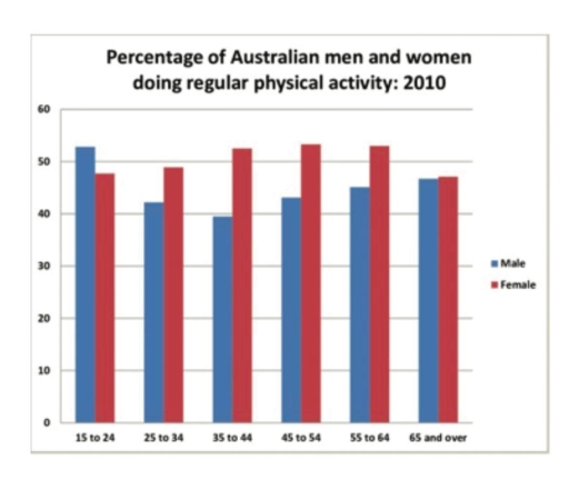
The bar chart below shows the percentage of Australian men and women in different age groups who did regular physical activity in 2010.

Data or diagram for the writing questionPractise this task →

Plan your answer

Try your own response before reading the samples.

Ideas to explore

  • Compare the sexes by age band: men have the higher rate only among 15–24-year-olds.
  • Describe the contrasting patterns: the male rate falls to a low among 35–44-year-olds before recovering, while the female rate rises to a plateau above 50% from ages 35 to 64.
  • Highlight the endpoint: the two rates are almost equal among people aged 65 and over.

Suggested structure

  1. Introduce the chart, population, measure, age groups, and year.
  2. Give an overview of the main gender contrast and the near-equal oldest-group figures.
  3. Describe the male figures across the age groups, noting the low and later recovery.
  4. Describe the female figures, noting the rise and peak, then compare the oldest group.
Useful vocabulary & examples
participation rate
The percentage of a group taking part in an activity.

The male participation rate reached its lowest point among 35–44-year-olds.

reach a low
Fall to the smallest value in the figures being discussed.

The figure for men reached a low of roughly 39% in the 35–44 age group.

peak at
Reach the highest value in a set of figures.

Female participation peaked at approximately 53% in two age groups.

remain almost level
Be very similar, with only a small difference.

The male and female rates remained almost level among those aged 65 and over.

Sample answers

AI-completed learning example

213 words · Illustrative target band

The bar graph provided shows a comparison of the levels of physical exercise among Australian men and women in different age groups in the year 2010. In 2010, the percentage of teenage boys who engaged in daily physical exercise was 52.8%. This percentage slightly decreased among individuals aged 25 to 34, reaching about 42.2%. Among men aged 35 to 44, the figure fell further to approximately 39.5%, its lowest point.…

Read full answer & analysis →

AI-completed learning example

178 words · Illustrative target band

The bar graph illustrates the proportion of males and females across various age groups engaging in daily physical exercises in Australia in 2010. Overall, females exhibited higher participation rates than males in physical activities. Males aged 15-24 were the most active, while females in the 45-54 and 55-64 age groups showed the highest engagement in 2010, at approximately 53% each. The male figure began at about …

Read full answer & analysis →

AI-completed learning example

188 words · Illustrative target band

The bar graph provides information on the proportion of various male and female age groups who performed daily physical exercises in Australia in 2010. Overall, the males belonging to the age group of 15-24 performed more regular physical activities during the given period, while for women, the age groups of 45-54 and 55-64 outperformed others. Looking at the figures in more detail, about 52% of men aged 15-24 did re…

Read full answer & analysis →