User-written IELTS example
Writing Academic Task 1 Band 4.0 Example
Original task prompt, user essay, band score, and related examples in the same report workspace.
Illustrative target band for this original model answer.
Plan your answer
Try your own response before reading the samples.
Ideas to explore
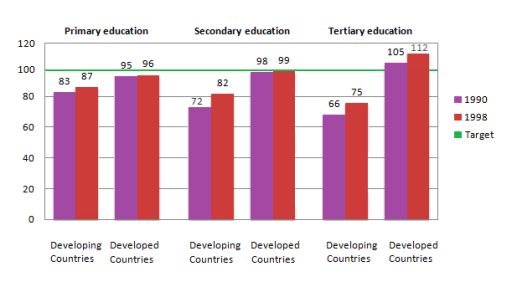
- Compare each country group with the parity benchmark of 100, noting that developed countries reached or exceeded it only in tertiary education.
- Identify the largest increase: developing countries’ secondary ratio rose by 10 points, from 72 to 82.
- Highlight the widest gap: tertiary education in 1998 had figures of 75 in developing countries and 112 in developed countries.
Suggested structure
- Paraphrase what the chart measures and state the years and education levels.
- Give an overview of the overall group difference and identify the most notable level.
- Describe the three developing-country ratios, including their changes over time and position relative to 100.
- Compare the developed-country figures and finish with the largest gap.
Useful vocabulary & examples
- gender parity
- Equal representation of females and males, shown here by a ratio of 100 girls per 100 boys.
The developed-country primary ratio was close to gender parity in both years.
- edge up
- Increase by a small amount.
The developed-country primary ratio edged up from 95 to 96.
- remain below the target
- Stay under a stated benchmark or goal.
All three developing-country ratios remained below the target of 100 in 1998.
- the gap between the groups
- The difference between the figures for two categories.
The gap between the groups was largest in tertiary education in 1998.
Task Prompt
User Essay Analysis
Review the public answer with report-style highlights.
The figure illustartes the count of male and female students who enrolled in various stage of studies such as primary, secondary and tertiary in both developing and developed countries in 1990 and 1998. Overall, it is clear from the graph that, in majority of levels, the number of girl joiners is less than that of boys. The chart gives figures for girls per 100 boys, and the green line marks a target of 100. In every education level, developed countries recorded higher ratios than developing countries. The figures also rose between 1990 and 1998 in all six groups, although most remained below the target.
In primary education, developing countries increased from 83 to 87 girls per 100 boys, while the corresponding figures for developed countries were 95 and 96. At secondary level, the ratio in developing countries climbed from 72 to 82; developed countries were close to the target, at 98 in 1990 and 99 in 1998.
The lowest numbers were in tertiary education in developing countries, at 66 and 75 respectively. By contrast, developed countries were the only group to exceed the target, rising from 105 in 1990 to 112 in 1998.
Targeted Improvement Tips
Related examples for this topic
Compare different bands on the same IELTS prompt.
The bar chart elucidates the gender distribution in education across varying levels and contrasting economic landscapes, specifically quantifying the number of female students p...
Band 8.0The bar chart compares the number of females per 100 males enrolled in primary, secondary, and tertiary education in both developing and developed countries in 1990 and 1998. A...
Band 7.0The chart illustrates the number of girls per hundred boys attending school at various educational levels over an 8-year period. Overall, developing countries reached their targ...
Band 6.0The chart compares the number of females per 100 males enrolled in different levels of school education, including primary, secondary, and tertiary education, in developed and d...
Band 5.0The bar graph illustrates the information about the enrollment of girls per 100 boys in various levels of school education( primary education, secondary education, and tertiary...
Band 4.0To illustrate, the bar chart shows the two genders,boys and girls registered in three different levels of the school educations,primary education,secondary education,tertiary ed...
