

Task 1 · line graph · 18 samples

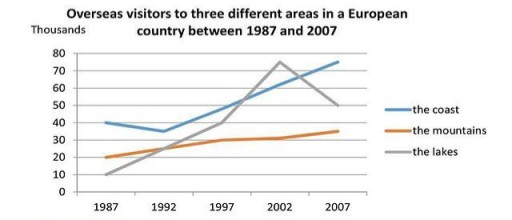
The graph below shows the number of overseas visitors to three different areas in a European country between 1987 and 2007 Summarise the information by selecting and reporting the main features, and make comparisons where relevant

Data or diagram for the writing questionPractise this task →

Plan your answer

Try your own response before reading the samples.

Ideas to explore

  • The coast grows overall despite a small dip between 1987 and 1992, then finishes with the highest visitor total.
  • The lakes show the largest fluctuation: a sharp rise to a 2002 peak followed by a substantial fall.
  • The mountains remain the least visited area at the end, but their numbers increase gradually rather than decline.

Suggested structure

  1. Introduce the graph, its subject, locations and time period.
  2. Give an overview of the broad trends, the lakes’ peak and the final ranking.
  3. Describe the coast’s starting point, brief decline and subsequent rise.
  4. Compare the mountains’ steady increase with the lakes’ rise and later fall.
Useful vocabulary & examples
rose steadily
increased gradually over a period

Visitor numbers for the mountains rose steadily from about 20,000 to 35,000.

peaked at
reached the highest point

The number of visitors to the lakes peaked at approximately 75,000 in 2002.

fell to
decreased and reached a particular level

The lakes’ figure fell to around 50,000 by 2007.

ended as the most popular destination
had the highest visitor figure at the end of the period

The coast ended as the most popular destination, at about 75,000 visitors.

Sample answers

AI-completed learning example

206 words · Illustrative target band

As we can see, the line graph depicts the amount of international tourists to different areas in a European nation in the period between 1987-2007. A glance at the graph reveals that there is an increase in the number of visitors in three domains of the coast, mountains and lakes over two decades. Beginning with the coast, about 40 thousand tourists visited this area in 1987. The figure went down a little to around 3…

Read full answer & analysis →

AI-completed learning example

199 words · Illustrative target band

The line graph displays the tourists in European country in verious areas. Overall, there was many changes in given 20 years for three areas but lakes areas had noticable change. To begin with, in 1987, for mountains and lakes areas had 20 and 10 thousands foriegn visitors. It increse slowley and steadily over 10 years and the coast had about 40 thousand. By 1997, the number for coast went up around 45 thousand, and …

Read full answer & analysis →

AI-completed learning example

208 words · Illustrative target band

The line graph depicts information about the proportion of tourists to three various region in a Europe throughout the period from 1987 to 2007. Looking from an overall perspective, it is readily apparent that the more number of overseas visitors prefer to see the coast in the timeframe except the year 2002. Talking about it in greater detail, in 1987 the coast was the most popular area, with about 40 thousand visito…

Read full answer & analysis →