AI-completed learning example
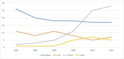
189 words · Illustrative target bandThe line graph illustrates the proportion of Australian exports to four countries—Japan, the US, China, and India—over the period from 1990 to 2012. Overall, Japan was the leading importer of Australian goods at the beginning of the period, but by the end, China had surpassed it. In contrast, the US and India exhibited lower export figures throughout. Japan’s share fell considerably from about 26% in 1990 to 20% in 1…
Read full answer & analysis →AI-completed learning example
190 words · Illustrative target bandThe line graph illustrates the percentages of Australian exports to four countries – Japan, the US, China, and India – from 1990 to 2012. Overall, Japan started as the primary export destination but experienced a significant decline over the period. Meanwhile, China surpassed the US to become the top recipient by 2012, with India also fluctuating modestly, reaching a peak before falling slightly at the end. In 1990, …
Read full answer & analysis →AI-completed learning example
192 words · Illustrative target bandThe line graph presented visually represents the percentages of Australian exports to four specific countries over a span of 22 years, from 1990 to 2012. Overall, the data depicts an upward trend in the percentage of exports to China, a gradual decline in exports to Japan, fluctuating trends in exports to the US, and significant growth in China's share, while India's figure rose before dipping slightly at the end. Ch…
Read full answer & analysis →