

Task 1 · line graph · 18 samples

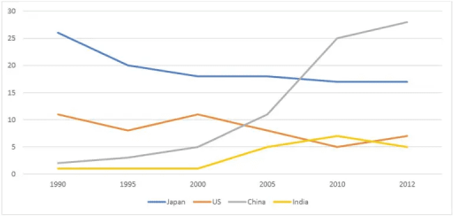
The line graph shows the percentages of Australian export with four countries. The graph below shows the percentage of Australian exports to 4 countries from 1990 to 2012

Data or diagram for the writing questionPractise this task →

Plan your answer

Try your own response before reading the samples.

Ideas to explore

  • Highlight the main crossover: Japan leads in the earlier years, while China overtakes it between 2005 and 2010.
  • Contrast China’s steep late increase with Japan’s gradual decline.
  • Note that the smaller series do not follow one pattern: the US fluctuates, whereas India rises to a peak and then falls.

Suggested structure

  1. Paraphrase what the graph measures and give the years covered.
  2. Summarise the overall ranking change and the main trends without listing every figure.
  3. Compare Japan and the US, using starting points, changes and final values.
  4. Describe China and India together, emphasising China’s sharp late rise and India’s smaller peak and decline.
Useful vocabulary & examples
accounted for
formed a particular percentage or share of the total

Japan accounted for about 26% of Australian exports in 1990.

rose sharply
increased quickly and substantially

China’s share rose sharply after 2005.

fluctuated
went up and down rather than changing steadily in one direction

The percentage for the US fluctuated over the period.

peaked at
reached its highest point at a particular value

India’s share peaked at about 7% in 2010.

Sample answers

AI-completed learning example

224 words · Illustrative target band

The information about Australian export with four different countries namely :- Japan, Us, China, and india for the period between 1990 and 2012 is depicted in the provided line graph. Looking from an overall perspective, it is readily apparent that japan country export had higest in the year 1990 while india had lowest then that year, at about 1%. Japan went down from 26% in 1990 to 20% in 1995, and then fell to 18%…

Read full answer & analysis →

AI-completed learning example

209 words · Illustrative target band

Here is a line graph which shows the australian goods exports in the time duration between 1990 to 2012 with the four counteries. Let’s look into it that whats the percentage of goods exporte from australia to the four country which is given in the line graph. Firstly, we can see from the line graph. Japan's share was about 26% in 1990, and it went down to 20% in 1995. After this it became 18% in 2000 and 2005, then …

Read full answer & analysis →

AI-completed learning example

188 words · Illustrative target band

The graph illustrates the percentage of goods or services sold to the other countries from Australia between 1990 and 2012. On the graph, percentages start from 0 to 35. Overall, exports to China and India is generally in growth even though it drops from 2010 to 2012 for India. On the other hand, the case for Japan and the US was different. Japan started at about 26% in 1990, making it the largest export destination …

Read full answer & analysis →