AI-completed learning example
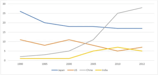
194 words · Illustrative target bandThe line graph below illustrates about australian exports to Japan,US,China and India from the years 1990 to 2012. Overall, exports to Japan ,US and India showed an decrease whereas, exports to china showed an increase. In the beginning of the year, the exports to india from australia showed a slight increase and reached to 15 per cent. This stated figure is not supported by the graph: India is at about 1% in 1990 an…
Read full answer & analysis →AI-completed learning example
189 words · Illustrative target bandThe line graph illustrates information about the percentage of selling Australian products with four other countries. Overall, the percentage of Australian export with China is rising constantly while it is plummeting steeply with Japan. On the other hand, the trend with United States of America (USA) is fluctuating. In 1990, the number of Australian product exports to Japan was about 26%, while the figures for the U…
Read full answer & analysis →AI-completed learning example
194 words · Illustrative target bandThe given graph illustrates the rate of Australian trade with the US, Japan, China and India. Overall, China had a striking upward trend in the period and experienced the highest variation in the percentage. Whereas, some slight changes occurred for the other countries in the years 1990, 1995, 2000, 2005, 2010 and 2012. In 1990, Japan was the largest destination, at about 26%, while the US accounted for roughly 11%. …
Read full answer & analysis →