

Task 1 · line graph · 18 samples

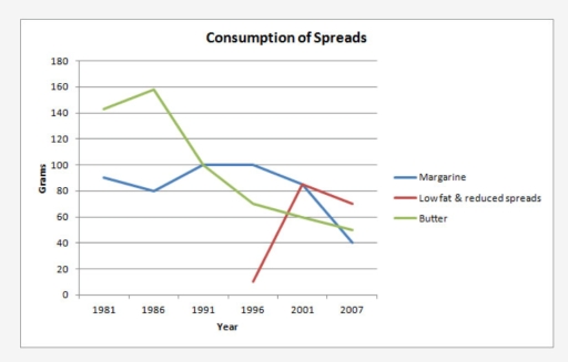
The graph below shows the consumption of 3 spreads from 1981 to 2007.

Data or diagram for the writing questionPractise this task →

Plan your answer

Try your own response before reading the samples.

Ideas to explore

  • Identify the overall direction of each line separately: margarine and butter fall over the full period, while the low-fat variety rises after it appears and then declines.
  • Highlight key turning points: butter peaks in 1986, margarine reaches a plateau around 100 grams in 1991–1996, and the low-fat line surges by 2001.
  • Mention crossovers where they change the ranking: Low Fat & Reduced Spreads is highest in 2001, while butter and margarine are no longer the leading series.

Suggested structure

  1. Introduce the graph, naming all three spreads, the years and the unit.
  2. Give an overview that accurately summarises the different overall patterns and the late-period ranking.
  3. Describe butter and margarine together, using their start values, peaks or plateaus and final values.
  4. Describe the later-starting low-fat series and compare its 2001 peak with the other spreads.
Useful vocabulary & examples
reached a peak of
rose to its highest recorded value

Butter reached a peak of approximately 160 grams in 1986.

remained stable at
stayed at approximately the same level

Margarine consumption remained stable at around 100 grams from 1991 to 1996.

overtook both alternatives
became higher than the other two series

Low Fat & Reduced Spreads overtook both alternatives in 2001.

eased to
fell slightly or gradually to a lower value

The low-fat spread eased to about 70 grams by 2007.

Sample answers

AI-completed learning example

203 words · Illustrative target band

The line graph illustrates information about the consumption of spreads between 1981 and 2007 Overall, the was a huge decline of butter consumtion, from 1986 to 2007, lowfat and reeuced spreads showed a little change between 1996 and 2007. the consumption of margrine declined through years. Firstly, in 1981 the consumption of butter showed about 140 grams. It then increased to approximately 160 grams in 1986, before …

Read full answer & analysis →

AI-completed learning example

212 words · Illustrative target band

The given graph illustrates the consumption of three variation of foods (margarine, low fat and reduced spreads and butter) between 1981 and 2007. In overall, we can see on the graph butter peaked at 1986 year and margarine fluctuated over the period. Low fat and reduced spreads reach a high point on 2001 year. When comparing the figures, butter was the most popular spread in 1981 and 1986, at about 140 and 160 grams…

Read full answer & analysis →

AI-completed learning example

192 words · Illustrative target band

The given graph illustrates the consumption of three variations of foods (margarine, low-fat and reduced spreads, and butter) between 1981 and 2007. Overall, we can see on the graph butter peaked in 1986 and margarine fluctuated over the period. Low-fat and reduced spreads reached a high point in 2001. When butter was rising over the first five years, margarine went down a little, from about 90 grams to 80 grams. Aft…

Read full answer & analysis →