

Task 1 · line graph · 18 samples

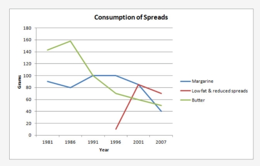
The graph below shows the consumption of 3 spreads from 1981 to 2007.

Data or diagram for the writing questionPractise this task →

Plan your answer

Try your own response before reading the samples.

Ideas to explore

  • Identify the overall direction of each line separately: margarine and butter fall over the full period, while the low-fat variety rises after it appears and then declines.
  • Highlight key turning points: butter peaks in 1986, margarine reaches a plateau around 100 grams in 1991–1996, and the low-fat line surges by 2001.
  • Mention crossovers where they change the ranking: Low Fat & Reduced Spreads is highest in 2001, while butter and margarine are no longer the leading series.

Suggested structure

  1. Introduce the graph, naming all three spreads, the years and the unit.
  2. Give an overview that accurately summarises the different overall patterns and the late-period ranking.
  3. Describe butter and margarine together, using their start values, peaks or plateaus and final values.
  4. Describe the later-starting low-fat series and compare its 2001 peak with the other spreads.
Useful vocabulary & examples
reached a peak of
rose to its highest recorded value

Butter reached a peak of approximately 160 grams in 1986.

remained stable at
stayed at approximately the same level

Margarine consumption remained stable at around 100 grams from 1991 to 1996.

overtook both alternatives
became higher than the other two series

Low Fat & Reduced Spreads overtook both alternatives in 2001.

eased to
fell slightly or gradually to a lower value

The low-fat spread eased to about 70 grams by 2007.

Sample answers

AI-completed learning example

196 words · Illustrative target band

The bar chart provides information about the percentage of births and deaths in Switzerland between 1970 and 2020, based on United Nations statistics. Overall,it is clear that the figure for birth rate contributes the highest numbers,while death has the smallest proportion. At the beginning of the period,the figure for birth remained stable at approximately 1.2. However, these opening details do not match the graph s…

Read full answer & analysis →

AI-completed learning example

186 words · Illustrative target band

The graph illustrates the rate of consumption of three spreads, which are margarine, low-fat and reduced spreads, and butter, from 1981 to 2007. It is clearly mentioned that margarine and butter are used earlier than low-fat and reduced spreads. The staple spread from the early 1980s until the early 1990s was butter. The consumption of butter then declined sharply after 1986, falling from about 160 grams to 100 grams…

Read full answer & analysis →

AI-completed learning example

211 words · Illustrative target band

The graph illustrates the rate of consumption of three spreads, which are margarine, low-fat and reduced spreads, and butter, from 1981 to 2007. It is clearly mentioned that margarine and butter are used earlier than low-fat and reduced spreads. The staple spread from the early 1980s till the early 1990s was butter. The consumption of butter fell considerably after its peak, while margarine followed a less consistent…

Read full answer & analysis →