

Task 1 · bar chart · 18 samples

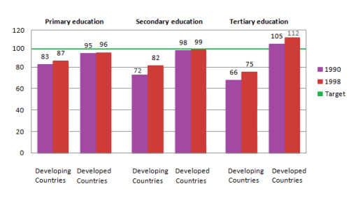
The chart below shows the number of girls per 100 boys enrolled in different levels of school education.

Data or diagram for the writing questionPractise this task →

Plan your answer

Try your own response before reading the samples.

Ideas to explore

  • Compare each country group with the parity benchmark of 100, noting that developed countries reached or exceeded it only in tertiary education.
  • Identify the largest increase: developing countries’ secondary ratio rose by 10 points, from 72 to 82.
  • Highlight the widest gap: tertiary education in 1998 had figures of 75 in developing countries and 112 in developed countries.

Suggested structure

  1. Paraphrase what the chart measures and state the years and education levels.
  2. Give an overview of the overall group difference and identify the most notable level.
  3. Describe the three developing-country ratios, including their changes over time and position relative to 100.
  4. Compare the developed-country figures and finish with the largest gap.
Useful vocabulary & examples
gender parity
Equal representation of females and males, shown here by a ratio of 100 girls per 100 boys.

The developed-country primary ratio was close to gender parity in both years.

edge up
Increase by a small amount.

The developed-country primary ratio edged up from 95 to 96.

remain below the target
Stay under a stated benchmark or goal.

All three developing-country ratios remained below the target of 100 in 1998.

the gap between the groups
The difference between the figures for two categories.

The gap between the groups was largest in tertiary education in 1998.

Sample answers

AI-completed learning example

195 words · Illustrative target band

The chart compares the number of females per 100 males enrolled in different levels of school education, including primary, secondary, and tertiary education, in developed and developing countries in the years 1990 and 1998. Overall, the most notable trend is that the figures of female students in all three categories of developed and developing countries rose between 1990 and 1998, with the developed countries gener…

Read full answer & analysis →

AI-completed learning example

208 words · Illustrative target band

The chart compares the number of females per 100 males enrolled in different levels of school education, including primary, secondary, and tertiary education, in developed and developing countries in the year 1990 and 1998. Overall, the most notable trend is that the figures of female students in all three categories of developed and developing countries rose between 1990 and 1998, while developed countries recorded …

Read full answer & analysis →

AI-completed learning example

201 words · Illustrative target band

The bar chart illustrates the proportion between girls and boys who enrolled in primary, secondary, and tertiary education in developing countries compared with developed countries in the year 1990 and 1998. Overall, in 1998, girls had more accesses in all levels of school education compared with in 1990. Girls in developed countries recieved more opportunities than those in developing countries, especially at tertia…

Read full answer & analysis →