



AI-completed learning example
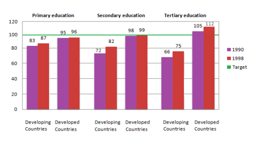
185 words · Illustrative target bandThe bar graph illustrates the information about the enrollment of girls per 100 boys in various levels of school education( primary education, secondary education, and tertiary education). produced from 1990 to 1998. The X-axis represents the developed countries and the developing countries, and the Y-axis demonstrates the number of female students. Overall, what stands out is that the figures were higher in develope…
Read full answer & analysis →