



AI-completed learning example
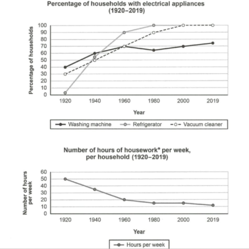
224 words · Illustrative target bandThe above line chart illustrates the change in the percentage of households that own three particular electrical appliances from 1920 to 2019, while the below line chart displays the number of hours spent on housework per week in each household across the same time period. Through observation of the above graph, it is apparent that ownership of all three appliances rose overall, whereas weekly housework time fell sub…
Read full answer & analysis →