



AI-completed learning example
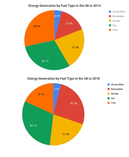
191 words · Illustrative target bandThe pie charts compare the energy production categorized by different fuel types in the UK between 2014 and 2018. In general, the percentage of renewable energy in generation increased considerably, while the figure for coal and nuclear power declined slightly over the period. Notably, the gas generation remained a stable proportion accounting for the largest share in both years. In 2014, gas was the largest source, …
Read full answer & analysis →