



AI-completed learning example
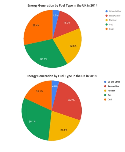
180 words · Illustrative target bandThe pie chart illustrates the proportions of energy generation using different fuel sources in the UK over two separate years, 2014 and 2018. Overall, while nuclear energy and coal recorded a decline in the production of energy over the 2014-2018 period, renewable energy followed an upward trajectory; however, oil & other and gas stood out for remaining unchanged in share. In 2014, gas was the largest source, at 30.1…
Read full answer & analysis →