AI-completed learning example
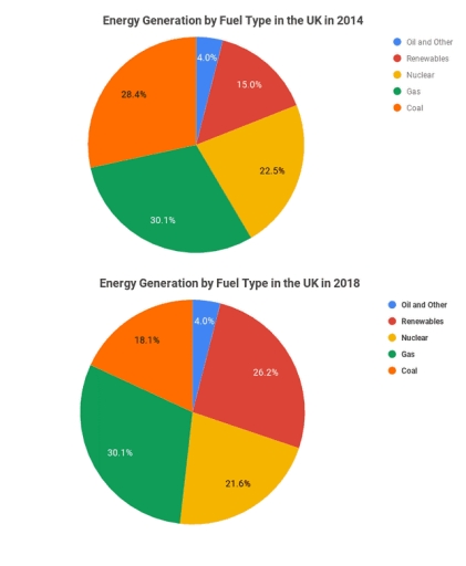
190 words · Illustrative target bandThe pie charts compare the proportions of energy generated from five different sources in the UK in 2014 and 2018. Overall, coal and nuclear experienced downward trends, albeit to varying degrees, over the four-year period. In contrast, energy production from renewable sources increased significantly, while gas and oil/other sources remained stable. Notably, gas continued to be the largest single source, accounting f…
Read full answer & analysis →AI-completed learning example
189 words · Illustrative target bandThe pie chart illustrates the energy generation from five different types of fuel in two separate years, 2014 and 2018. In general, the proportion of energy manufactured from renewables experienced an upward trend, while coal and nuclear showed the reverse. Notably, energy generation from oil and other, as well as from gas remained stable throughout the period, at 4.0% and 30.1%, respectively. The most striking chang…
Read full answer & analysis →AI-completed learning example
200 words · Illustrative target bandThe pie chart gives detailed information about the proportion of energy harnessed from different types of fuel – coal, renewables, nuclear, gas, and oil and other – between 2014 and 2018. Overall, the energy from renewables increased significantly, while there was a fall in the energy generated from nuclear and coal. Additionally, the energy produced by gas remained unchanged, while the share from oil and other sourc…
Read full answer & analysis →