

Task 1 · line graph · 18 samples

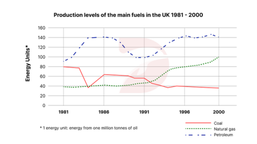
The graph below shows the production levels of the main kinds of fuel in the UK between 1981 and 2000. Summarise the information by selecting and reporting the main features, and make comparison where relevant.

Data or diagram for the writing questionPractise this task →

Plan your answer

Try your own response before reading the samples.

Ideas to explore

  • Petroleum was the leading fuel throughout, reaching about 140 in the mid-1980s, dipping around 1990–91, then recovering to a similar level.
  • Coal had a sharp early fall, a partial rebound, and then a longer decline to about 35 by 2000.
  • Natural gas stayed near 40 for much of the 1980s, rose strongly after 1991, and ended at about 100, above coal but below petroleum.

Suggested structure

  1. Introduce the graph by naming the three fuels, the UK, the years and the unit.
  2. Give an overview of the overall ranking and the contrasting directions of change.
  3. Describe petroleum’s rise, dip and recovery with key dates and approximate figures.
  4. Compare coal’s decline with natural gas’s later growth, including their end values.
Useful vocabulary & examples
remain the leading source
continue to have the highest production level among the categories.

Petroleum remained the leading source throughout the period.

fall sharply
decrease quickly and substantially over a relatively short interval.

Coal production fell sharply to around 40 in 1984.

recover to approximately
rise again after a decline to reach a similar or specified level.

Petroleum recovered to approximately 140 in 1996.

overtake
become greater than another category after previously being lower.

Natural gas overtook coal in the early 1990s.

Sample answers

AI-completed learning example

206 words · Illustrative target band

The line graph illustrates the production levels of three kinds of fossil fuel in the UK from 1981 to 2000. Overall, while level of petroleum and natural gas increased remarkably, the opposite was true for coal in the given period. Also, no fuels were producted more than petroleum. In 1981, the number tones of generated energy units for each fuel can be compared. Petroleum was about 90 units, while coal stood at 80 a…

Read full answer & analysis →

AI-completed learning example

193 words · Illustrative target band

the line graph shows the generating steps of the energy resource in last 19 years from 1981 until 2000 in British. Overall, the petrol was the highest product, while natural gas and coal were the lowest expenditure in the using of energy fossil fuel. In the 1981, natural gas manufacture started from 40 units, afterwards it stayed around 40 units until 1988. After that, it increased slowly and reached about 50 units i…

Read full answer & analysis →

AI-completed learning example

198 words · Illustrative target band

Mentioned graph illustrates different kinds of fuels produced by UK since 1981 to the year 2000. Overall, 3 type of fuel produced by UK, Natural gas production has surged drastically, petroleum production also increased, whereas coal production has dropped. In 1981, Natrual Gas production as near 40 tonnes and there was a very little growth until around 1988, when it began to rise slowly. By 1991 it was about 50 unit…

Read full answer & analysis →