

Task 1 · line graph · 18 samples

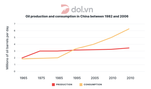
The line graph below shows the oil production and consumption in China between 1982 and 2006.

Data or diagram for the writing questionPractise this task →

Plan your answer

Try your own response before reading the samples.

Ideas to explore

  • Compare which series begins higher and which one ends higher; here, production starts slightly above consumption, but consumption finishes much higher.
  • Identify the different rates of change: production rises gradually, while consumption accelerates after the early plotted years.
  • Mention the axis-label problem: the task’s stated dates do not match the displayed years, and the last year is printed twice.

Suggested structure

  1. Introduce the graph, measures, and units.
  2. Give an overview of the overall direction and the main contrast between the two lines.
  3. Describe production’s starting level, plateau, and gradual later rise.
  4. Describe consumption’s early stability and sharper increase, then compare the final plotted values.
  5. Briefly note that the displayed dates are inconsistent or duplicated where this affects interpretation.
Useful vocabulary & examples
rose gradually
increased slowly over time

Oil production rose gradually after remaining near 3 million barrels per day.

remained stable
stayed at approximately the same level

Production remained stable at around 3 million barrels per day for a period.

increased substantially
went up by a large amount

Consumption increased substantially and reached about 6.3 million barrels per day at the final plotted point.

the gap widened
the difference between two values became greater

The gap between oil consumption and production widened as consumption climbed.

Sample answers

AI-completed learning example

171 words · Illustrative target band

The line graph illustrates China’s production and consumption of oil from 1982 to 2006. In this period, the amount of oil being produced has remained relatively constant. On the other hand, the consumption of petrol has taken a sharp increase since 1990 and has overtaken the production in 1994. In 1982, China produced 2 millions of barrels per day, while consumption was slightly lower, at just under 2 million barrels…

Read full answer & analysis →

AI-completed learning example

192 words · Illustrative target band

Oil production and consumption The line chart gives information about the amount of oil which produced and consumed in China over the period from 1982 to 2006 Overall the manufacture and expenditure of oil experienced an upward trend over the the given period. It is obvious that oil consumption witnessed was a lot higher than oil production. At the start, the two figures were close: production stood at around 2 milli…

Read full answer & analysis →

AI-completed learning example

242 words · Illustrative target band

The provided line graph illustrates the fluctuations of Chinese production and consumption of the oil over a period of 24 years, commencing in 1982. Overall, the figures of both oil producing and consuming recorded an upward trajectory. However, while the Chinese oil-making industry saw a gradual growth, it seemed that the volume of oil used increased considerably faster. Overall, both series increase, but consumpti…

Read full answer & analysis →